
More John Krasinski for Gap (Updated)
November 1, 2007 by Kath Skerry
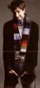 Anyone happen to have the number of the art director and stylist for John Krasinski’s Gap ad campaign? I’d like to have a few words. I just think it takes a lot of effort to make the boy look not cute, and somehow they have succeeded.I mean he doesn’t look horrible, but I’ve seen hundreds of pictures of him looking a million times more adorable. This is a national campaign! John Krasinski will be plastered all over Gaps nationwide over the next 2 weeks, and for those who don’t watch The Office this is their first exposure to JKras. I could take a better picture with my polaroid. You know how it pains me to be negative about anything having to do with the boyfriend, but back me up here…these aren’t the best shots of him, right?
Click the image above to enlarge. Click here if you missed the first John Krasinski Gap Ad.
Update: Just to show you how easy it is to make this boy look good. I just took about 3 minutes and created my own John Krasinski Gap Ad. Much better…right?

Thanks to ‘gap’ (although not The Gap) for sharing. ‘gap’ works for The Gap and says the ads will be up in stores over the next two weeks.
Related Posts
Filed under Jim Halpert, John Krasinski, The Office


I agree completely! And was wondereing what was going on!
I agree too. They could definitely do so much better. I think that the clothes really don’t do much for him in these ads. What guy would wear a multi-colored scarf? That’s just my opinion.
Ya – not so good. He doesn’t look cute at all, and this picture is worse than the first one we saw. (He doesn’t look bad, just not as cute as we know he can be!)
We all know John loves his sweaters–maybe these photos actually reflect how he looks day to day? Who knows. Maybe not the best ever, but he still looks dreamy to these eyes…
I thought the first one was okay, but this one is just bad. Wow!
i think he looks good, though i do like the first one better. i just wanna snuggle up to him! haha
[…] reading this post by: Give Me My Remote For more… RSS […]
I agree, this ad is pretty terrible. I think I get what they were going for, but for some reason it just didn’t work. Every other pic I’ve seen of him is great, I dont know what happened here, but I say fire that photog asap!
Awww. I like the second one. He looks completely adorkable! And I see that he passed on the word about the man cardi’s to the GAP stylist. 😉
Thank you, GMMR! So glad to know it’s not just me. JKras is adorable, but not in these ads.
Kath, your ad is so much better!!! I love your slogan, “Be noticed at The Office” 🙂 So cute!
I agree, the real ad makes him look….I don’t know, just weird. He still looks cute but, I think it has so much to do with that awkward pose. He looks like he is shrugging in a very child-like way. It’s just…..not good.
The Gap should definitely hire you!
What I would like to know is, where is John Krasinski’s publicist and why isn’t he/she on the phone barking at The GAP’s marketing department for making his/her client look like a total geek? Where’s Debbie Mazor when you need her?
There’s a difference between adorkable and just plain horrible and this picture is just bad. I could live with the first one, this one is awful.
[…] reading this post by: Give Me My Remote For more… RSS […]
I definitely agree that JKras could look A LOT better. Someone should contact the art director/stylist for this photo shoot and tell them to redo it!
I think he looks adorable in both! Really everyday down to earth type of guy -esk.
I think the ads are supposed to be silly and cute. It’s hard for our boy not to look cute. I like the ads, especially the second ones. They have more context when you look at them with the Will and Amy one.
I actually like the second one a little better than the first. I’m always in the minority but the second one makes him look really bashful and dorky. That’s how I like my Johnny K!
But your probably right about people’s first impressions based on these photos.
That outfit is so horrible, what normal guy is going to put on a sweater jacket w/ a rainbow scarf?! The pic is a mess.
I don’t see what you all are talking about. He looks cute — and funny — which is clearly what they were going for (other models Will Arnett and Amy Poehler). And, about the choice of clothes — they had to dress him in their product and these outfits are fine.
I don’t agree with you at all. Ok, the pics could’ve been better, he looks nice but not supercute as usual. besides that, do you seriously think that he doesn’t look good in those clothes??? oh, my…I think he looks amazing.
The guy is 28, why should he look like 40 year old lawyer or something?
Hey now… I have the 4′ tall poster that was displayed in the store (of the first picture). Maybe it’s because it’s cropped different, or that there’s a life sized Jim Halpert in my home “office,” but I can’t stress enough how huggably adorable he looks. Prankster expression captured flawlessly. Makes me smile every time I look over my shoulder. Love the clothes, besides.
What are you all talking about? he looks gorgeous. Like always.
I think he looks good in both pictures.
He’s cute in anything he wears, except when he had that horrid haircut in season 3.
I don’t think it looks like he dyed his hair o.o
I went by GAP today and I actually liked the picture! It looks much different when you see it at the store.
LOVE the real ad! He looks so cute!
I LOVE JOHN KRASINSKI. YOU GUYS THAT THINK HE IS UGLY ARE CRAZY AND BLIND. HE ISS SOOOO GORGEOUS !!
JKras LOOKS BURNING HOT! GO TO THE STORE & SEE THEM, THEY’RE COMPLETELY DIFFERENT THERE I THINK YOU’LL LIKE THEM BETTER! AND DONT YA THINK THESE SHOW SOME CHARACTER UNLIKE MOST ADS??
I think he looks great in both of the ads. It shows off a little of his personality. I work at GAP so I see this pictures everyday. They look A LOT different in person. But the whole idea of the indivuals campaign (which has been a GAP mainstay since 1988) is to photograph celebrities and to show off their personalities. I don’t see anybody commenting on the Will Arnett and Amy Poehler picture which is far more bizarre than this one. As far as the clothes go…in this picture he’s wearing a cardigan (it looks weird because of the way he has it stretched out) with a crazy stripe scarf. All of the celebrities with the exception of Arnett/Poehler are wearing them in their pictures. Also this picture is part of an entire ad campaign. I dont’ think that the picture makes complete sense when you see it by itself. So I urge you to go to GAP or go to gap.com and see the ad as a whole.
Can I be the lone objector?
It’s actually funny you say that “This may be the first time someone sees him/knows who he is . . ”
I went mallin’ (yep, that’s right, I said it) with my mom. We were literally in mid-step, and I stopped dead in my tracks. It was the “scarf” ad. I said, “Um, who is that? Because it is honestly the most adorable guy I have ever seen.” Luckily my mom’s more with it than I am, and she told me he was on “The Office,” which I’ve seen a few times but just haven’t caught up with.
. . . I got the DVD sets for the first two seasons within a week of each other, after renting a random disc from a random season at Blockbuster and loving it. John Krasinski is definitely good-looking, but even that wouldn’t get me so hooked. The show itself is just awesome, a truly incredible ensemble cast. I guess some of the long-term fans have seen better in terms of pictures of him, but believe me, to someone new to The Office scene, the ads look really great!
All the best and a very cool site,
Katie
The office is one of the most brilliant shows on television right now, so im pretty sure that whatever John decides to wear in a gap ad, it really isnt going to matter. He is absolutely handsome in a quirky, unique way and thats exactly what i LOVE about him. He’s hilarious and truly makes “The office” whole. I cant believe im writing on this ridiculous thing but my infatuation with him and the show took over 🙂
(oooh! sidenote…he inspired me to read “Brief Interviews with Hideous Men” and i must say it is one of the most interesting pieces of work ive ever read. Although it didnt necessarily ‘change my life’ i would recommend it to anyone.)
His looks are actually plain, but Oh so nice to look at. Its cool to see that there is someone out there in Hollywood that looks real. Too much of Brad Pitt and all those other guys that hollywood considers hunks and are on the magazine covers every single month gets boring. I applaud the gap for choosing John Krasinski as theyre model. He’s hot. 🙂